created, $=dv.current().file.ctime & modified, =this.modified
tags: Programming UI
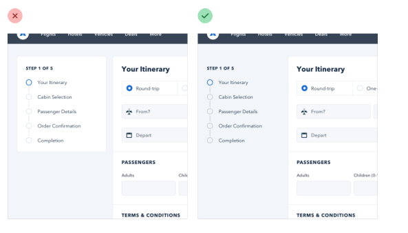
Start with a feature, not a layout
An app is a collection of features. Before you’ve designed a few features, you don’t even have the information needed to make a decision on how the navigation should work.
Detail comes later
By designing in grayscale, you’re forced to use spacing, contrast, and size to do all of the heavy lifting.
Personality is composed of
- font choice - elegant or classic look with serif, or playful sans-serif
- color
- border radius - large border radius is more playful, no radius is formal or serious.
- language - less personal tone is more official or professional, while using friendlier more casual language makes a site feel friendlier.
Limit your choices
Define systems in advance. Instead of picking values from limitless pools start with a smaller subset.
Design by process of elimination. Systematize everything.
Hierarchy
Relying too much on font size to control hierarchy is a mistake, often leading to primary content that is too large and secondary content that is too small.
Things like varying font color or weight are better markers. Similarly using a softer color for supporting text makes it clear what text is secondary without reducing readability.
Emphasize by de-emphasizing
Instead of trying to further emphasize and element, you can give inactive elements a softer color so they sit more into the background.
Outside of forms, When you present data without labels it’s much easier to emphasize important or identifying information.
Combine labels and values, for example if you need to display inventory in an e-commerce website instead of saying “In stock: 12” say “12 left in stock”
In the case of information dense pages, like technical specifications of products, where users will be scanning the page for a label it is appropriate to put labels.
Semantics are secondary
Primary actions should be obvious. Secondary actions should be clear, but not prominent. Tertiary actions should be discoverable but unobtrusive.
Layout and Spacing
Start with too much white white space, and remove until you are happy with the result.
 Dense UIs have their space in dashboards.
You don’t have to fill the whole screen. Spreading things out can just make things difficult to interpret.
Fonts
Use good fonts. Ignore typefaces with less than five weights. Optimize for legibility.
For best reading experience keep your paragraphs between 45-75 characters per line. The easiest way to do this is to use the em unites, which are relative to current font size. A width of 20-35em will get you in the right ballpark.
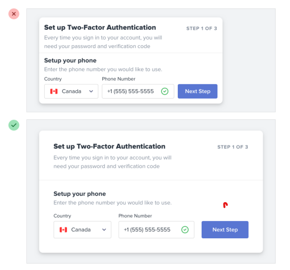
Shadows
Shadows can be more than just a a flashy effect. They allow placement of elements on a virtual z-axis to create a meaningful sense of depth.
Small shadows with a tight blur radius make an element feel only slightly raised, while larger shadows with a higher blur radius make elements feel closer to the user.
Shadows can have two parts. Each part has a specific job.
box-shadow: 0 4px 6px hsla(.0%, .7), 0 5px 15px hsla(.0%, .1);
The first shadow is larger and softer, with a considerable vertical offset and large blur radius. It simulates the shadow being cast behind an object by a direct light source.
The second shadow is tighter and darker, with less a vertical offset and smaller blur radius. This simulates the shadow underneath an object, where even ambient light has a hard time reaching.
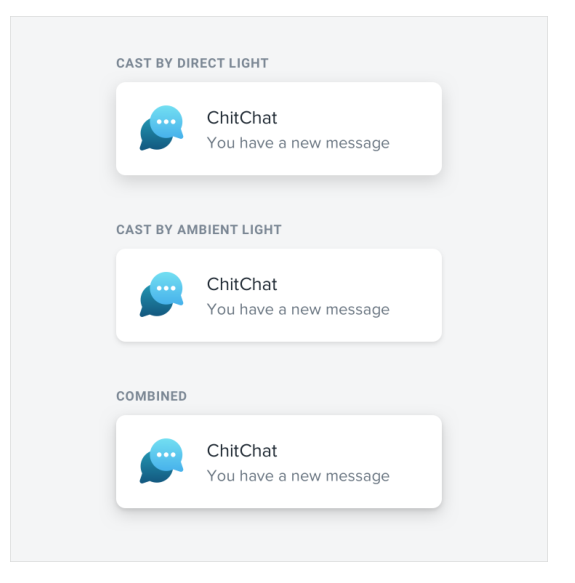
Overlap elements to create layers
Use good photos
Bad photos will ruin a design, even if everything else looks great.
Control shape and size of user uploaded content.
background-size: cover